Image
Source
Kim, Ina. 2018. “A Fake Map.” In Toxic Correspondence, created by Ina Kim. In Visualizing Toxic Subjects Digital Exhibit, curated by James Adams and Kim Fortun. The Center for Ethnography. March.
Language
English
English
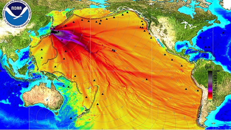
The map has been circulated on the internet after the Fukushima disaster. This map indicates how radioactivity was spread out all over the Pacific Ocean and how severe the influence of the disaster was. However, it was turned out that the map is based on no convincing proof. What visualized features are easy to be circulated? What traits captivate people's attention? How does the discourse of toxicity and visualization of toxicity interact with each other? How do the public differentiate and filter legitimate scientific knowledge from "the fake scientific knowledge"?
Source: https://bigthink.com/strange-maps/fake-map-fukushima-disaster-radiation