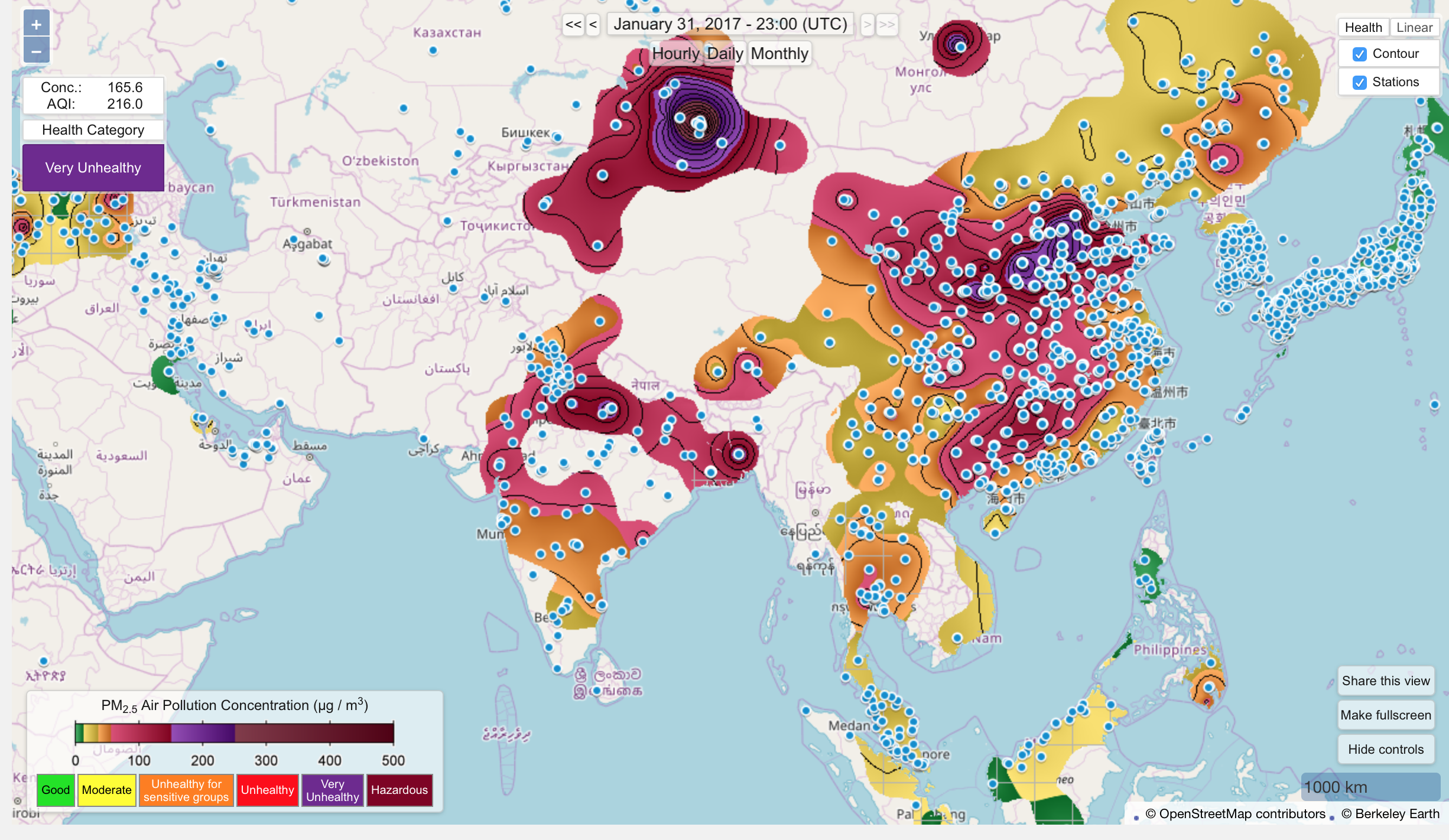
I took this screenshot from Berkeley Earth's Air Quality Real-time Map. The map can be zoomed-in and zoomed-out. So I had to choose the framing of my screenshot. I did not want to choose a flat, connected world though that would tell the story of a global air. I did not want to zoom-in only to Delhi or only to India though that would surely tell the story of urban air or national air. I chose a framing that scientific papers use to tell the story of a world mapped on an axis of progress. In this map, Delhi can be discerned only by a cluster of blue dots (which represent surface monitoring stations) in north India. The map shows that air flows but is contoured by concrete geographies. It presents in full view the different scales that would be confronted by environmental governance: transnational, national, regional, urban, rural. The data comes from surface monitoring stations which means the map also represents highly local dynamics. Visualising air this way troubles scale.

I took this screenshot from Berkeley Earth's Air Quality Real-time Map. The map can be zoomed-in and zoomed-out. So I had to choose the framing of my screenshot. I did not want to choose a flat, connected world though that would tell the story of a global air. I did not want to zoom-in only to Delhi or only to India though that would surely tell the story of urban air or national air. I chose a framing that scientific papers use to tell the story of a world mapped on an axis of progress. In this map, Delhi can be discerned only by a cluster of blue dots (which represent surface monitoring stations) in north India. The map shows that air flows but is contoured by concrete geographies. It presents in full view the different scales that would be confronted by environmental governance: transnational, national, regional, urban, rural. The data comes from surface monitoring stations which means the map also represents highly local dynamics. Visualising air this way troubles scale.